Why This Project
Many users wanted to reflect, manage stress, or practice gratitude, but they lacked a simple, consistent way to do it. The idea of a Journaling tool emerged to:
- Engage inactive users & improve retention.
- Give first-time users a low-barrier self-help tool.
- Support therapy journeys with reflection between sessions.
User research quotes shared by Product Managers leading the project reinforced this:
“I only journal when I’m stressed, then I forget about it.”
“I want to write, but I don’t know where to start.”
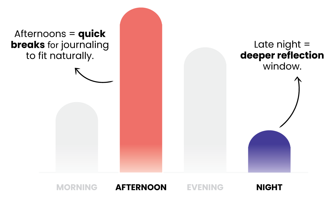
At the same time, time-of-day patterns revealed two natural emotional windows:
- Afternoons (the platform’s busiest period): Users dipped in for quick breaks, stress relief, and “regroup” moments
- Late evenings: A quieter, reflective window where users were already seeking emotional processing
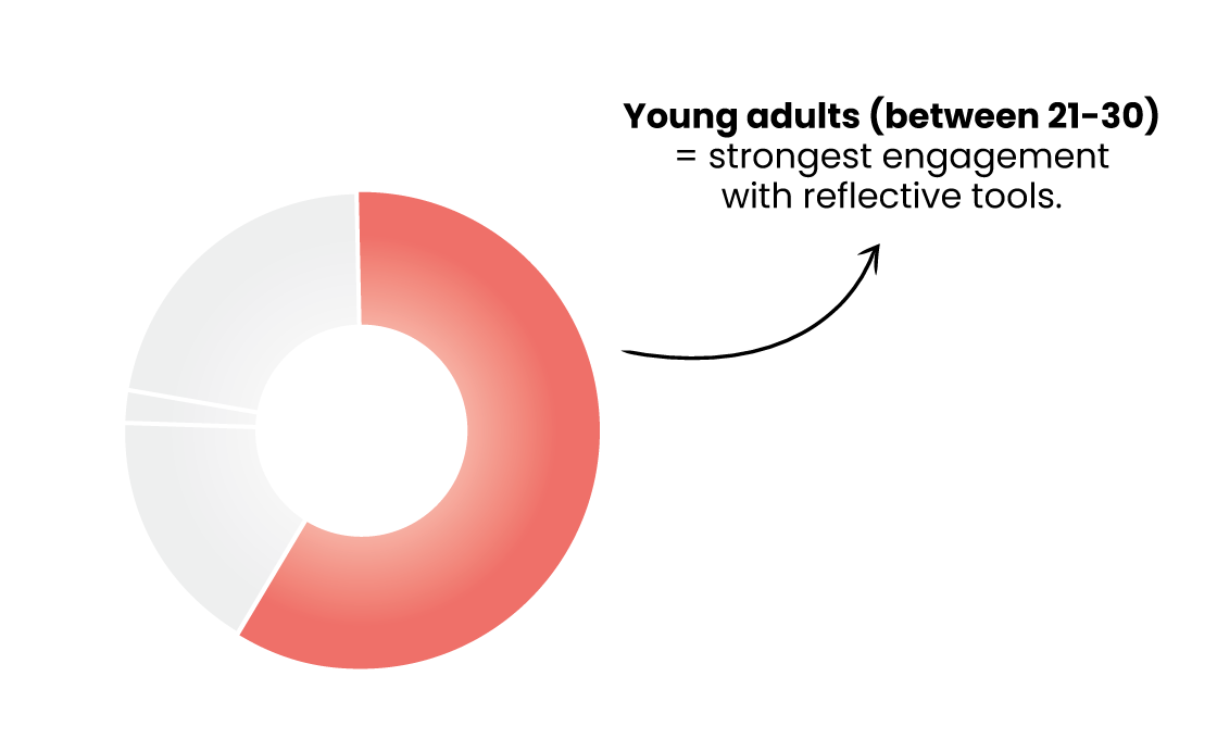
From our reports, we also saw that the young adult demographic dominated platform usage, a demographic already inclined towards self reflection, personal growth and digital self-care routines.
The opportunity was clear: journaling could help users turn scattered, occasional reflection into a daily ritual, but only if we removed friction and made it feel approachable.
The Challenge
From research and surveys, three main blockers stood out:
- Lack of direction: Users didn’t know what to write.
- Habit difficulty: Forgetting or losing motivation.
- Effort barrier: Journaling felt heavy or time-consuming.
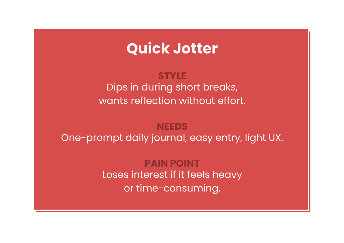
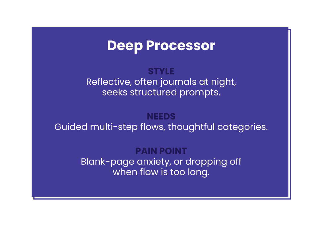
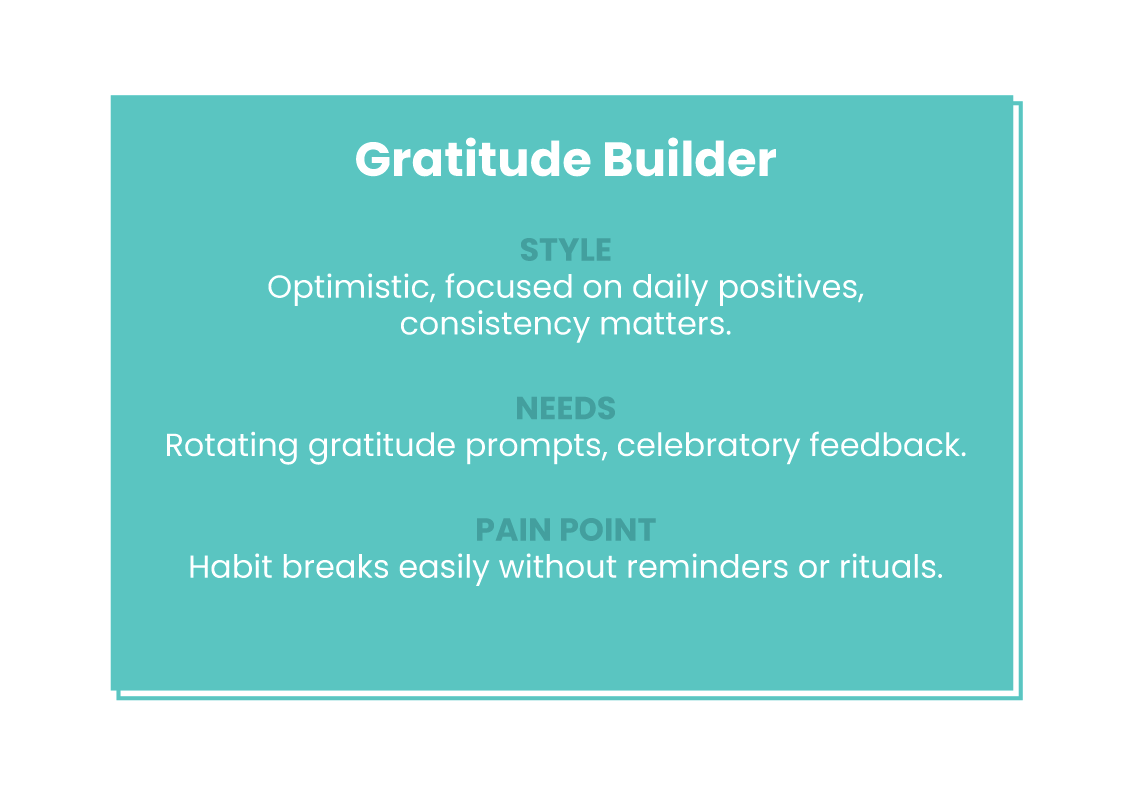
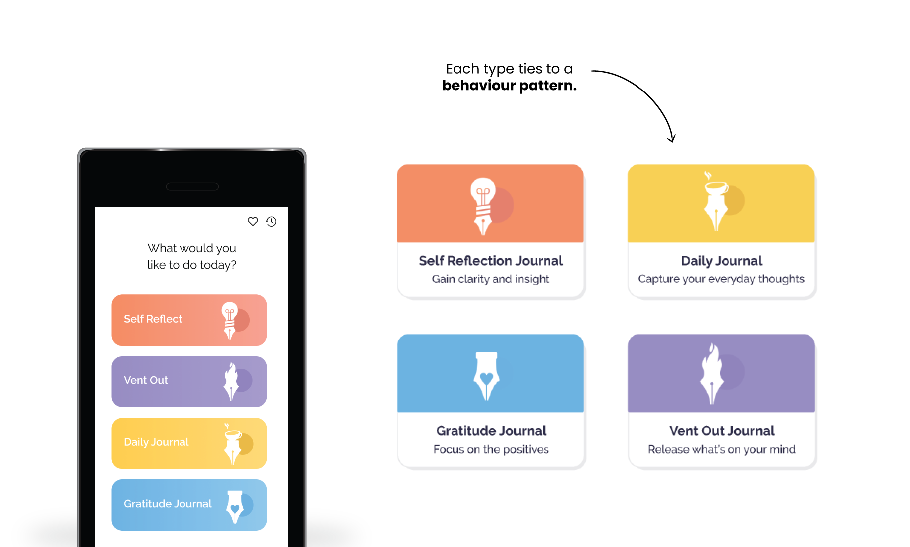
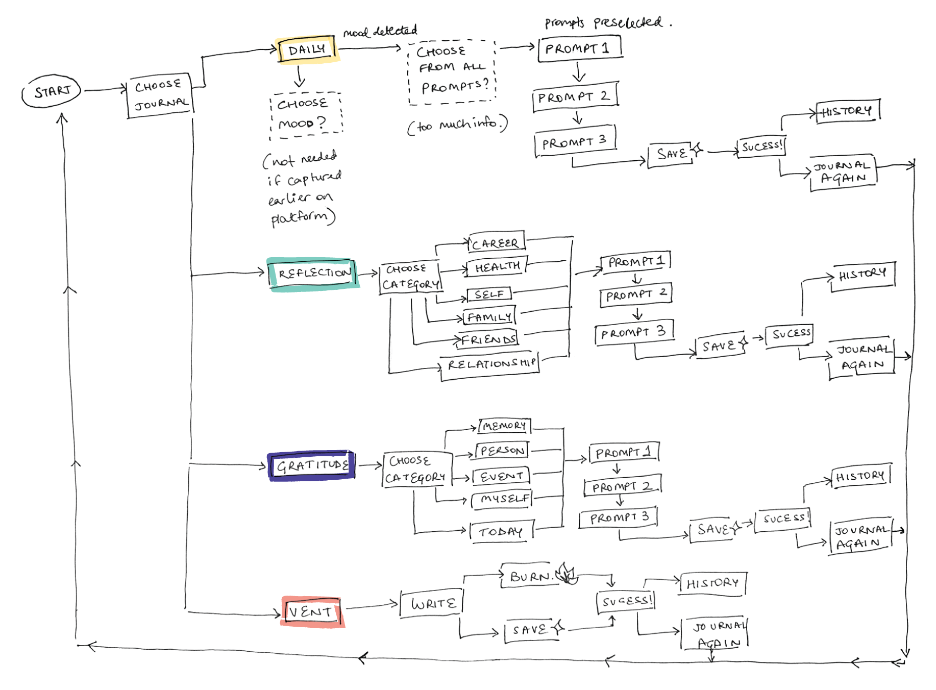
Our research also highlighted different journaling behaviours, which directly shaped the four journal types we designed:
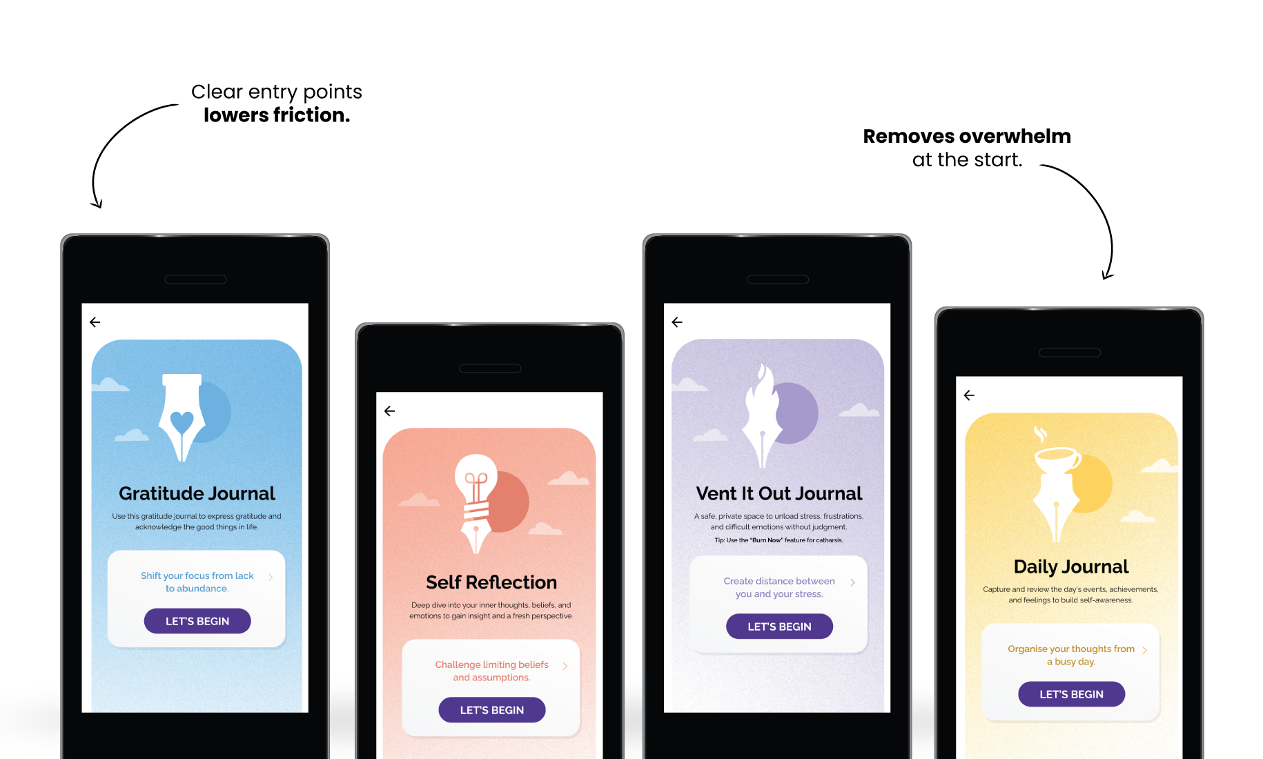
• Daily journal for quick jotters who wanted a low-barrier, one-prompt entry.
• Self-reflection journal for deep processors who valued guided multi-prompt flows at night.
• Gratitude journal to help users sustain a positive daily ritual and build resilience.
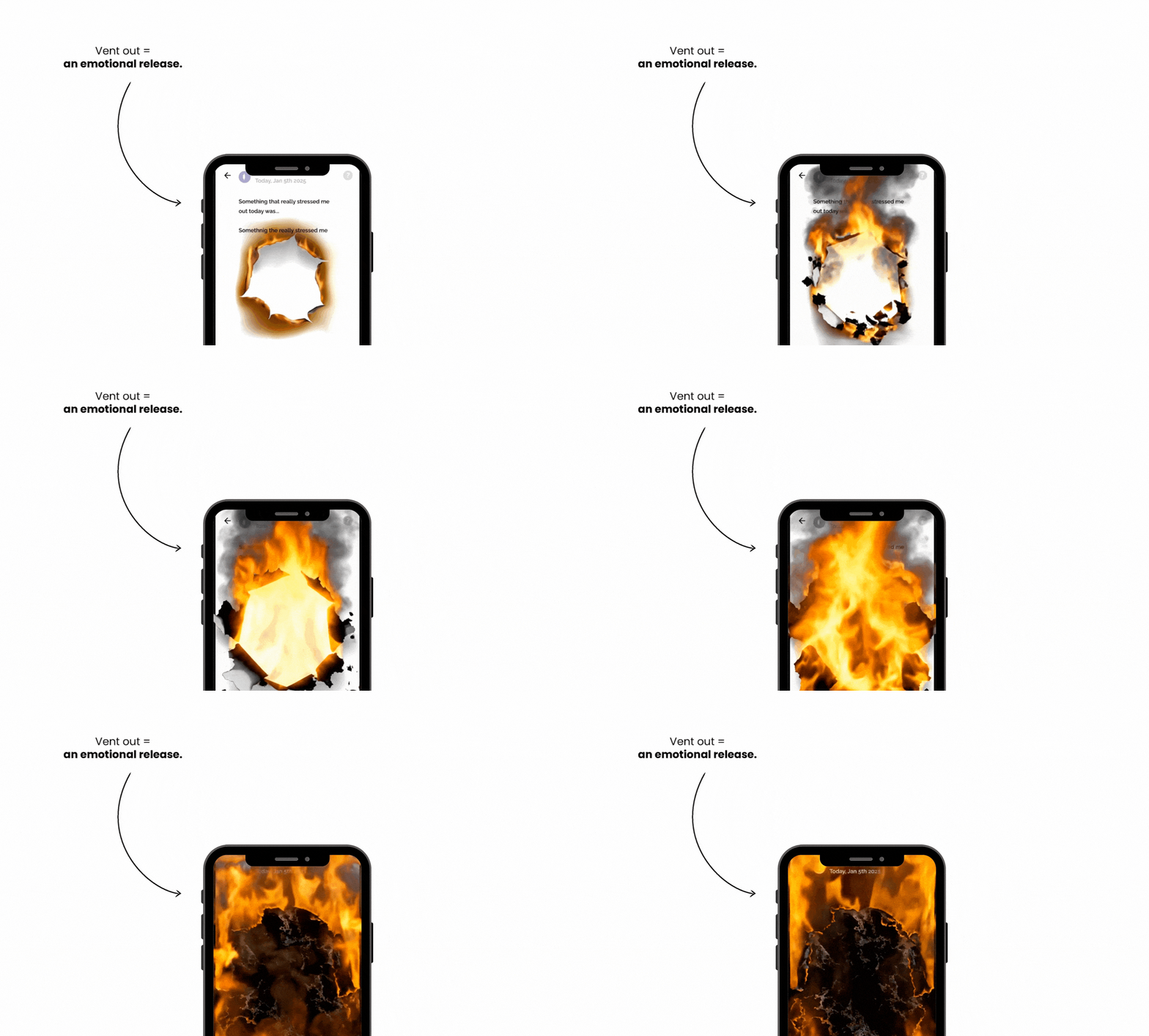
• Vent-out journal for catharsis, where users could “burn” an entry without saving it to memory.
These matched platform usage data: around half of all sessions happen in the afternoon (quick breaks), but late-night reflective use remained strong.
The Goal
- Provide multiple journaling types (gratitude, daily, self-reflection, vent-out).
- Make starting easy: guided prompts, sample answers, nudges.
- Support habit-building with reminders and feedback.
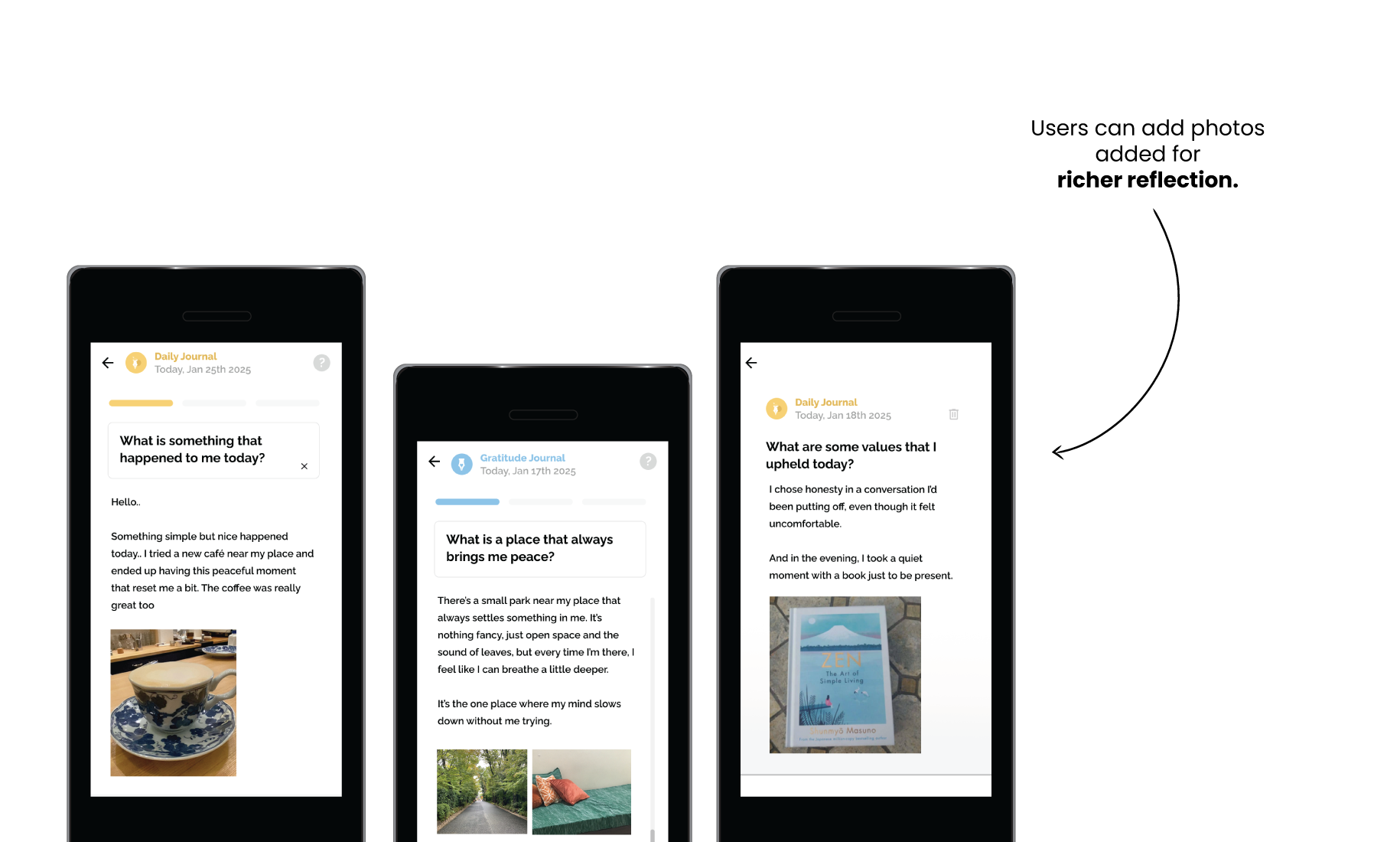
- Ensure flexibility: free-flow, audio journaling, photo uploads.
- Support habit-building with reminders, feedback, and mood-based entry points.
First Steps

User Interviews: Began by speaking with users one on one about why they journal. Most struggled with where to start and how to stay consistent.
Counsellor Insights: They shared that users often repeated the same issues across sessions, journaling could build reflection between appointments.
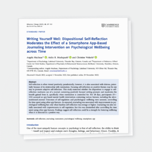
Competitor Analysis/Research: Reviewed leading journaling apps & papers to understand prompt patterns, pacing, and blank-page anxiety. Source
How I Designed It
Structuring the Four Journaling Types
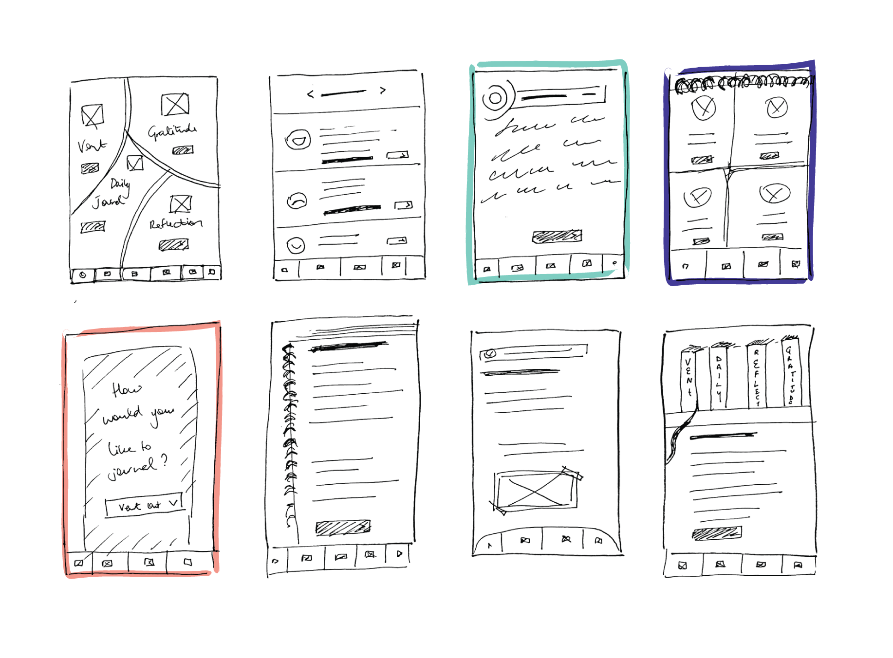
I designed journaling as a system, not a single feature. Four clear entry points: Daily, Gratitude, Self-Reflection, Vent-Out matched different emotional rhythms.
This reduced decision fatigue and made the experience feel personalised from the first tap.
Prompts & Guided Journaling
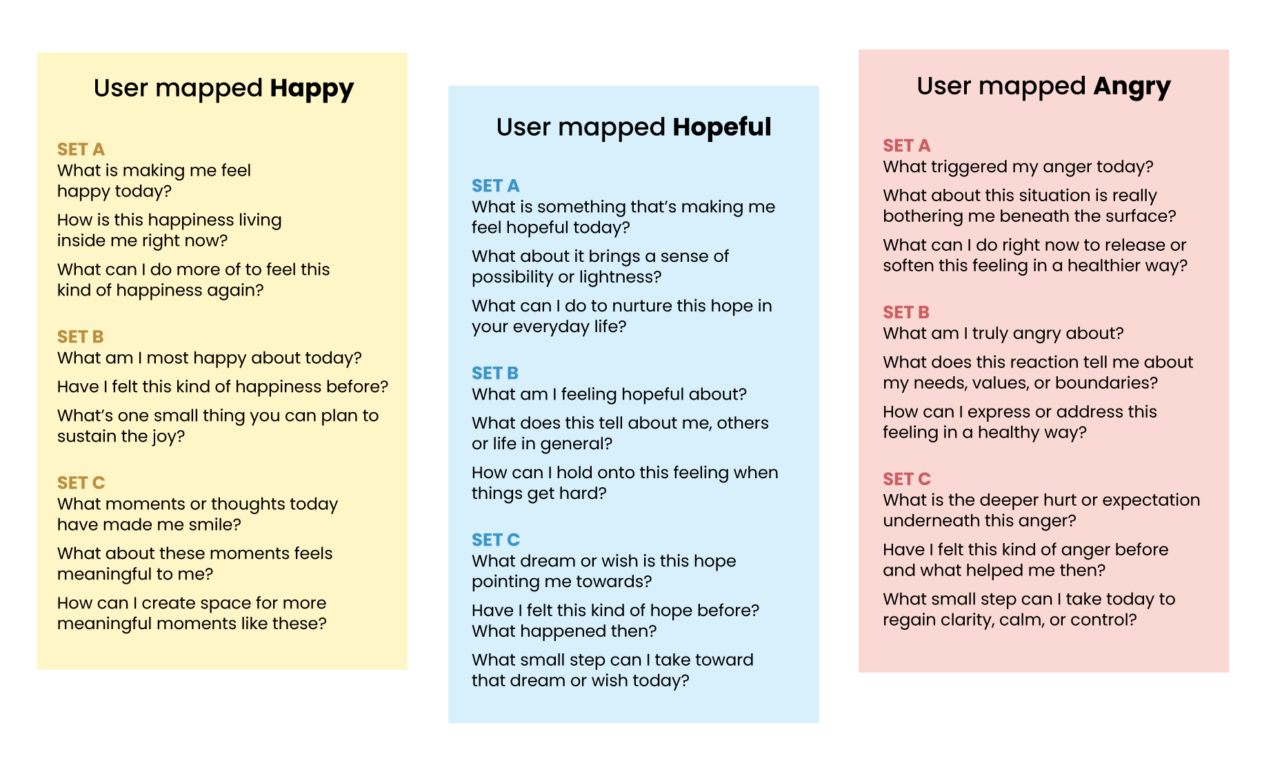
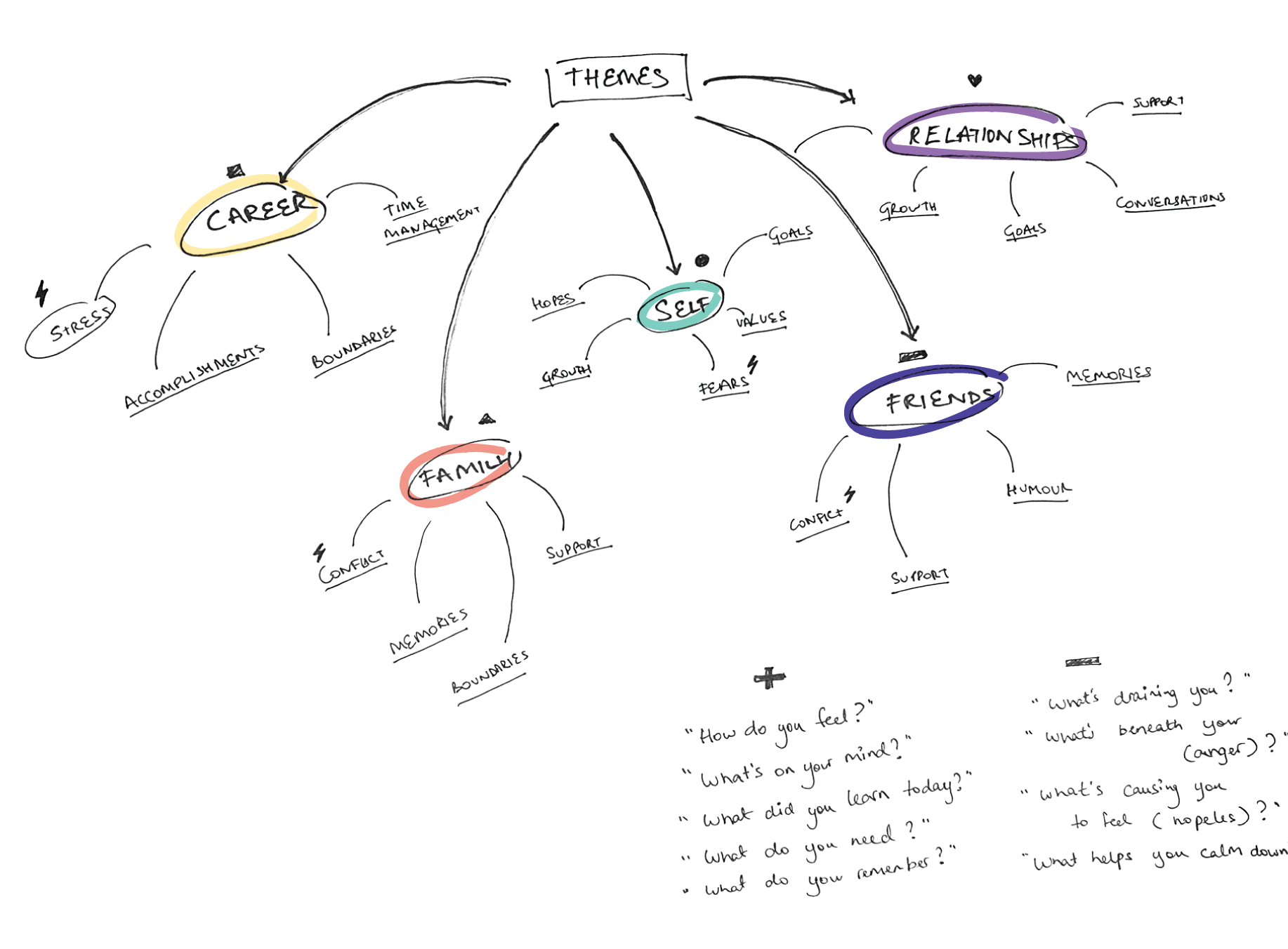
• Themes: career, family, relationships
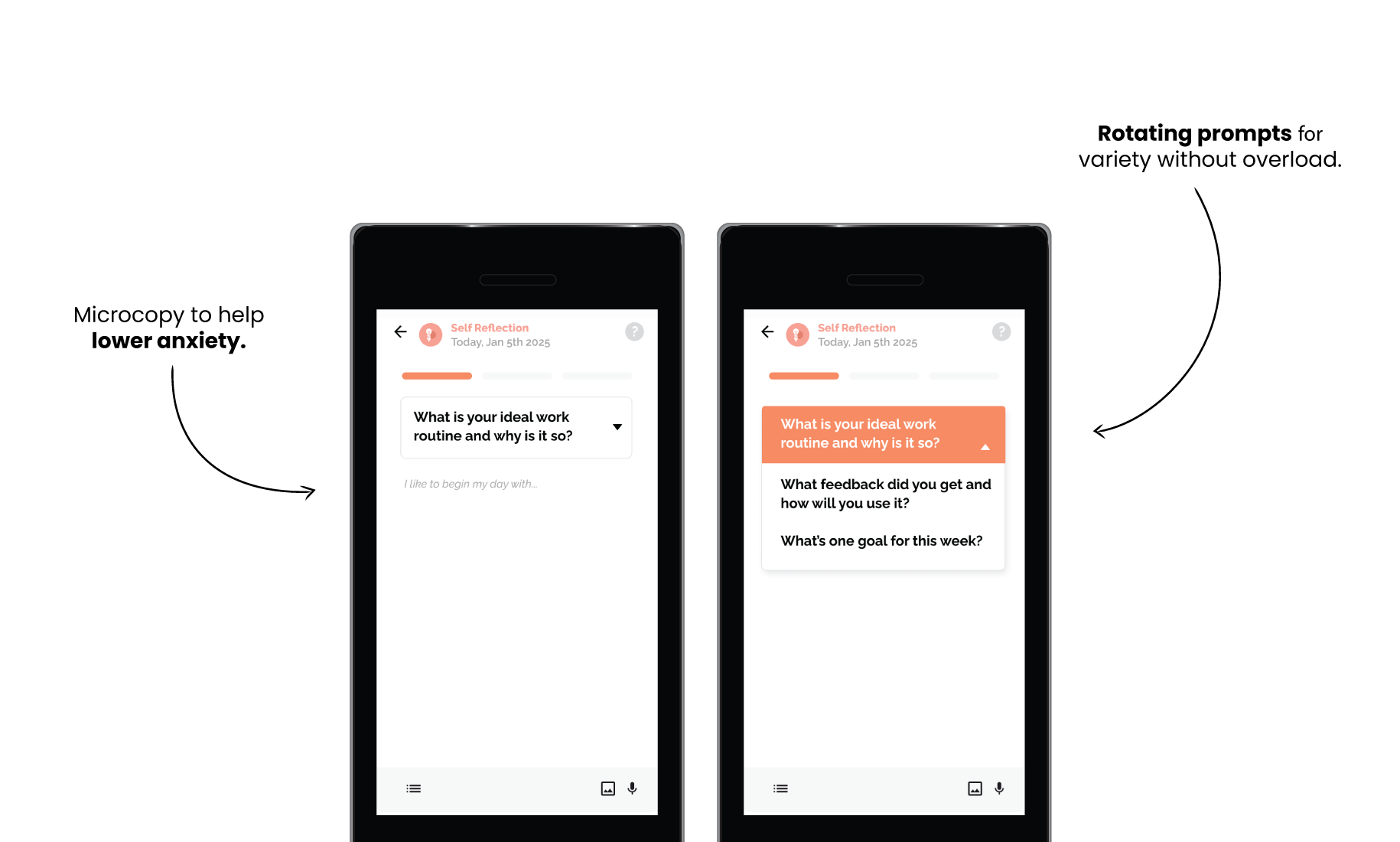
• 5 rotating prompts per theme + shuffle
• Mood-linked prompts dynamically suggested
• Supportive microcopy (“I’m worried that…”) to reduce intimidation
UI Design & Interactions
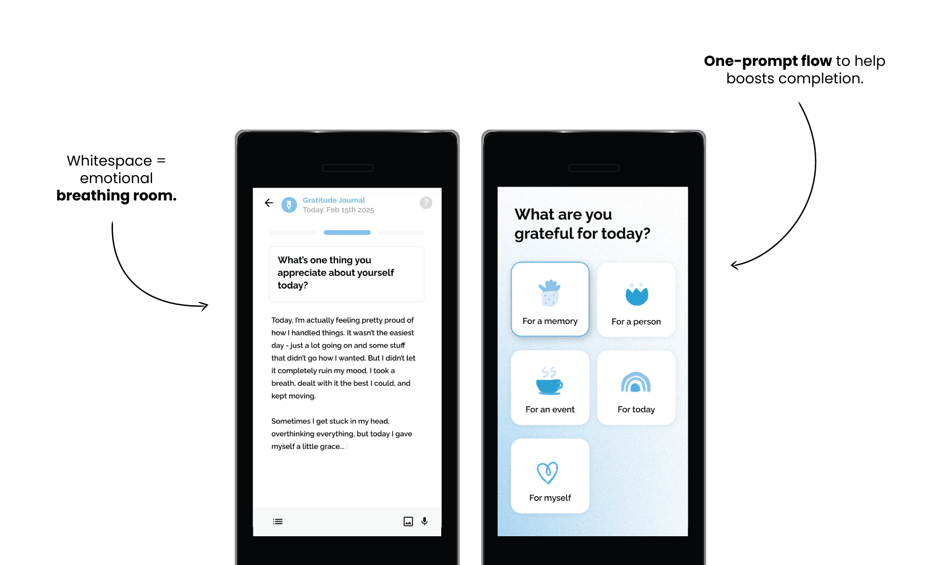
Calm, minimal visuals: whitespace, muted colours, supportive typography.
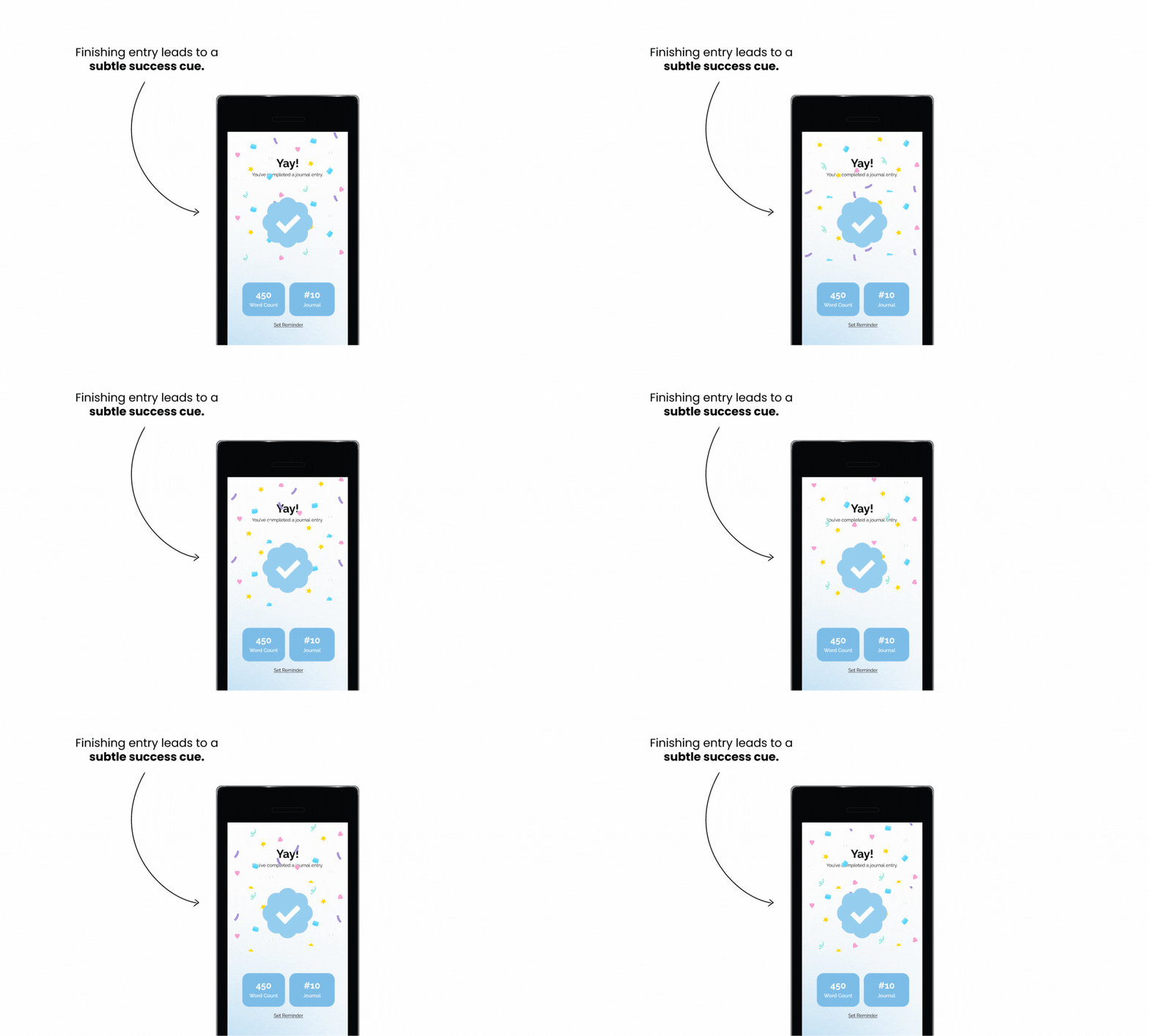
Completion screens designed with tiny celebratory animations to reinforce habit loop.
Journal history: list of past entries, favourites, “reflect again.”
Favourites + reflect again to keep things going.
Simplified the flow to one prompt at a time.
Expanding Beyond Text
Audio journaling: first version used only a mic icon confused testers. Iterated to add labels + onboarding screen.
Capturing the mood of user for more contextual prompts.
Photo uploads: contextual journaling with images.
Vent-out journal: free-flow “burn or save” entries for catharsis.
Working Process
Hurdles Along The Way
Prompt overload: Early multi-step flows asked users to answer too much at once. Most people dropped off after the second step, so we simplified the experience to one prompt at a time to keep the flow light and doable.
Reminder tone: Our first push copy felt kind of bossy. We shifted to gentler, supportive nudges like “Take two minutes for yourself today,” which tested far better and aligned with the emotional tone users needed.
Audio journaling not launched: We explored and tested audio journaling, but storing sensitive voice data securely was a challenge. Until the backend infrastructure could support it safely, this feature remained on hold.
History page: Early versions made users dig into each entry one by one. It felt clunky and tiring. We redesigned it into a continuous, scrollable history so people could see their reflections build over time.
Projected Results
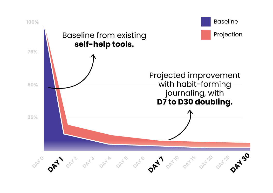
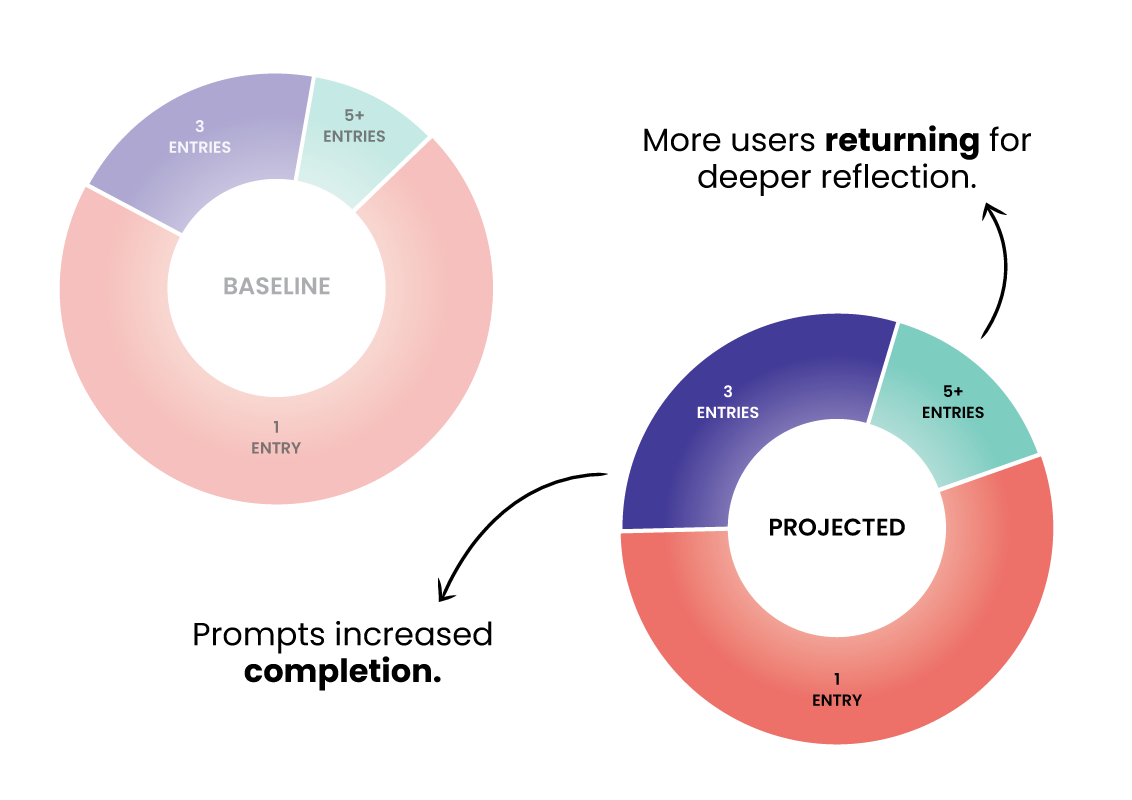
Retention is projected to rise gradually by D7 and D30, based on patterns from existing self-help tools.
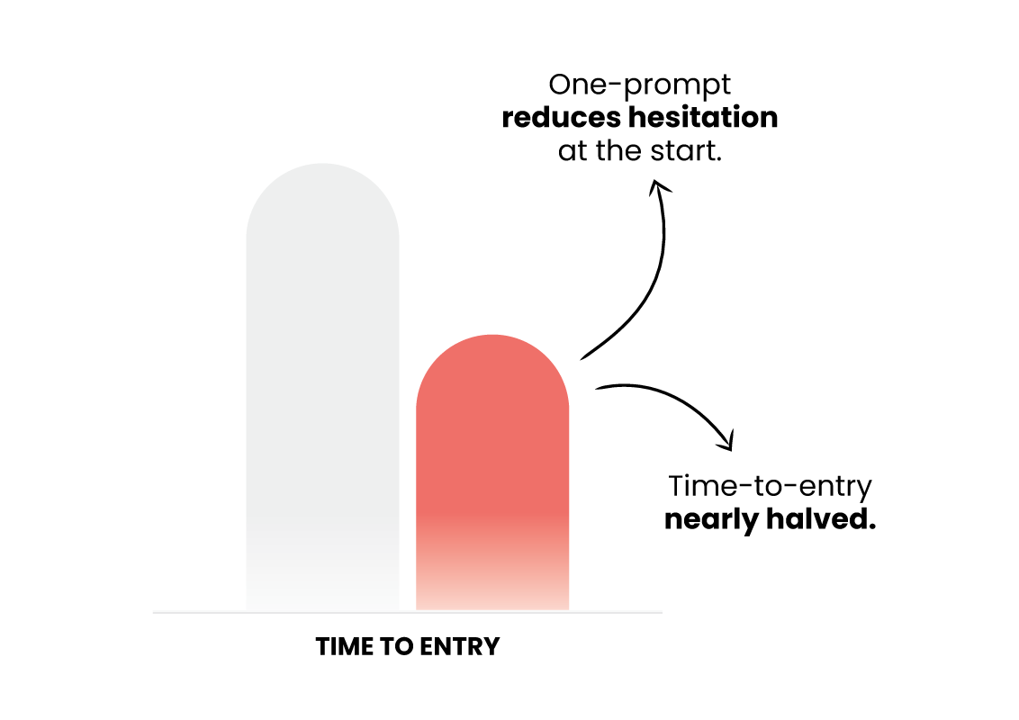
Time-to-entry projected to drop nearly 50% with the simplified one-prompt flow.
A higher share of users is expected to cross 3+ and 5+ entries, indicating deeper engagement.
Key Takeaway
The Journaling feature turned what was once a blank, intimidating page into a guided, approachable ritual. By simplifying flows, offering multiple journaling styles, and reducing friction at every step, we gave users a tool they could actually stick with, whether they needed a quick release, structured reflection, or a moment of gratitude.


